
Fotbollsbolagett
Fotbollsbolaget has a website that presents their company and the services they offer. Their core expertise is in soccer, with a focus on helping young players reach the next level through personalized training. As the founders are friends of mine, I saw an opportunity to both support their business and challenge myself by rebranding and redesigning their UX and UI. This allowed me to deepen my understanding of design principles while also delivering a high-fidelity prototype they can potentially implement.
My design process

1. Analyzing the current design
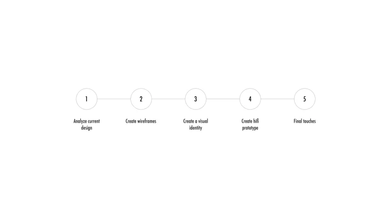
So why does fotbollsbolaget need a rebrand? I saw a possibility to learn more about prototyping a website from start. Their website needed an upgrade both in regards to their UI but also UX. Some examples of errors found were that some elements were not aligned and that the flow and buttons were hard to understand.
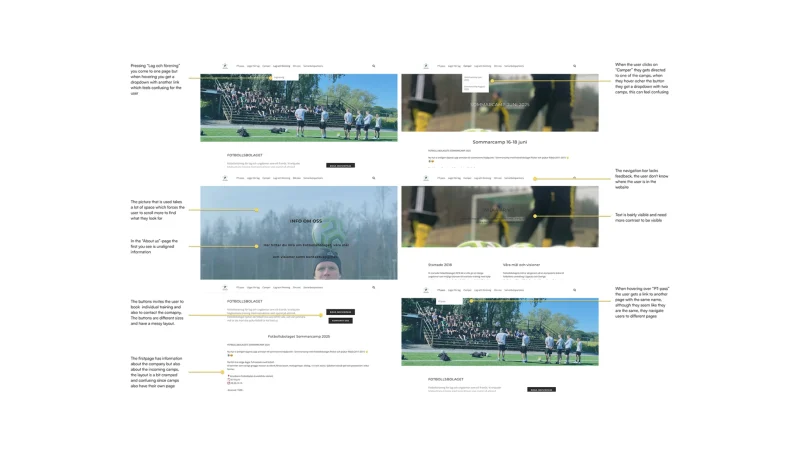
I tested the website and found multiple hard to use and understand areas. I found the navigation unnecessarily confusing and I also identified problems with design principles. I saved all pages in my Figma-file and commented on all found problems. Some of them can be seen in the picture below.
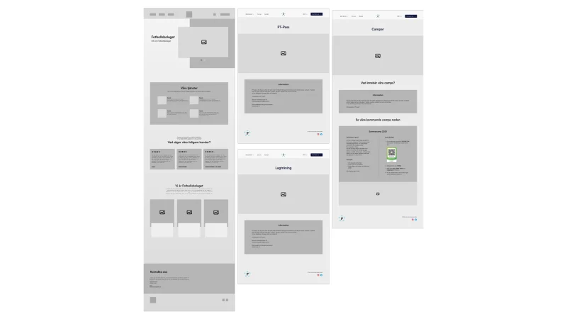
A more professional visual expression and improved user experience can be created, some of my ideas are:
– Choosing higher-quality images with a clearer connection to the surrounding information
– Structuring the layout properly using grids
– Improving the contrast between text and background
– Creating a clearer hierarchy of information so users can more easily find what they’re looking for
– Designing a clearer menu structure
– Presenting information more concisely to reduce the number of pages
– Providing better feedback on hover and click
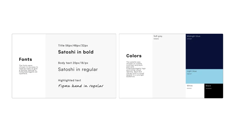
– Create a cohesive design by selecting a consistent color palette, clear fonts and similar shapes for other elements
– Using the logo more effectively to strengthen the brand and make the company more recognizable
– Designing with better accessibility in mind through improved contrast and clearer navigation

2. Creating wireframes
Using Figma, I translated my first sketches into low-fidelity wireframes. I added text and placeholders to see how I could create a layout that was visually appealing and also easy to use and navigate. At this stage, the wireframes were defined enough for some user testing done by me. Afterwards I made a few alternations and iterations to create better pages. Then I moved on to creating high-fidelity prototypes.

3. Creating the visual identity
I developed a visual identity using images available on their current website, complemented by a carefully selected color palette and font choices. The color palette was inspired by their existing branding, particularly the colors found in their logo while also ensuring sufficient contrast for accessibility and visual clarity. The fonts were chosen for their readability and to reflect the warm, approachable character of a family-owned business that caters to a younger audience.
