Y.SHARK
Y.SHARK is a microbrewery located on the island of Ingarö, in Stockholm. I stumbled upon their website and was immediately intrigued by how their brand and visual first impression could be enhanced. I looked through and tried the Y.SHARK website and found smaller flaws in their UI and UX. I wanted to expand my visual design knowledge by trying to rebrand and redesign their website with my style, which in this project is represented by clean, modern, and energetic visuals.
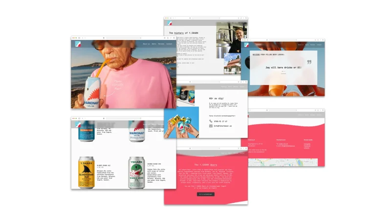
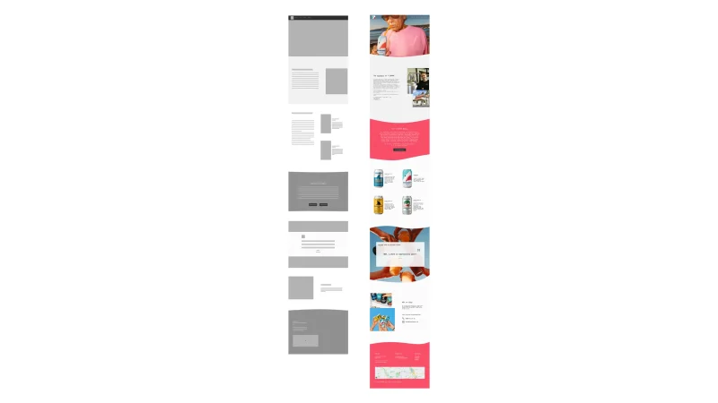
Preview of a Final redesign

My design process
1. Analyzing the current design
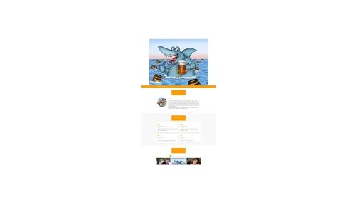
The current site is fun, light, and has a bright orange color accompanying a big animated header that makes the website feel vibrant.
What it lacks is a professional look. The low-cost feel works somewhat with the microbrewery image, but has room for improvement. I could see potential in using more cool imagery that conveys “beer” and “shark” in a more modern way. I also felt that the website lacked product images, images of the founders, and relevant information such as contact information.
2. Create a new visual identity
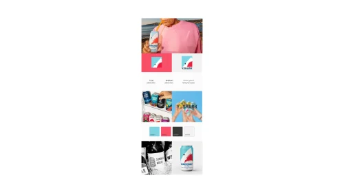
I wanted to rebrand by creating a more engaging and fun look. I searched Pinterest and played with generative AI to create a mood board and visual branding guide.
Creating a visual profile helped me decide on colors, fonts, and images that could be incorporated later to create the vibe I was looking for.
3. Low fidelity to High fidelity
4. Final thoughts